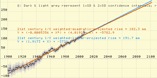
(The orange line is a minimum-variance unbiased estimator quadratic fit to the data, and the negative quadratic coefficient and slight downward curve indicate deceleration in rate of sea level rise.)
Nick Palmer asked:
Re: "we've had well over half a century of increasing CO2 levels which have been accompanied by no acceleration in sea level rise at all."
Where on earth do you get your information? Wattsupwiththat?
Depending on where you look, the 20th century average is about 1.6mm/year. The rate since the '90s is about 3.1 mm/year. Sure looks like an increasing rate to me, or does your pathological "scepticism" not allow you to admit that? Also bear in mind that the bigger rate increases will happen because of land based ice melt, which is just getting going.
click for CSIRO graph
I get my information by analyzing tide station data, mainly the raw data from GLOSS-LTT tide stations, but also processed data from (for instance) Church and White.
For example, here's a graph which I made by applying Church & White's 2006 paper's methodology to their more recent sea level data (called "2009" but really just through 2007), for years 1900 and later. As you can see, the acceleration in rate of sea level rise following the end of the LIA had ceased by 1930, and despite all of humanity's greenhouse gas emissions there's been no sustained acceleration in global mean sea level rise since then:
(The orange line is a minimum-variance unbiased estimator quadratic fit to the data, and the negative quadratic coefficient and slight downward curve indicate deceleration in rate of sea level rise.)
A simple average of the sea level trends measured by the 159 GLOSS-LTT tide gauges around the world (which is the very best data we have on coastal sea levels) yields an average rate of sea level rise of only about 0.6 mm/year. More sophisticated averaging, which takes into account the uneven geographical distribution of the tide gauges, yields a global average mean sea level rise of just over 1.1 mm/year.
The widely bandied about 1.6 - 1.8 mm/year figure for global coastal mean sea level rise over the last century is the result of "correcting" actual data by adding adjustment factors calculated from computer models. The late John Daly explained it well:
"The impression has been conveyed to the world's public, media, and policymakers, that the sea level rise of 18 cm in the past century is an observed quantity and therefore not open to much dispute. What is not widely known is that this quantity is largely the product of modeling, not observation, and thus very much open to dispute, especially as sea level data in many parts of the world fails to live up to the IPCC claims."
The IPCC achieves the appearance of acceleration by splicing together sea level graphs measured at different locations. Since the rate of sea level increase or decline varies drastically from one location to another, by splicing graphs from different locations they can create the appearance of either acceleration or deceleration, as desired.
The 1.6 mm/year (which is really about 1.1 mm/year) was based on adjusted and averaged measurements from coastal tide stations.
The 3.1 mm/year figure was based on satellite measurements of the open ocean's sea level.
Different locations have different rates of sea level rise.
Here's the kicker: Coastal tide stations (over the last ~75 years), on average, show a very slight decline in rate of sea level rise. Satellite measurements (over the last ~18 years) also show the rate of sea level rise declining. Only by committing fraud can the alarmists create graphs which appear to show acceleration in rate of sea level rise, when both tide gauges and satellites show none.
It is Just Plain Wrong to splice together sea level numbers from different locations in the same graph. Dr. Willem de Lange, of New Zealand's University of Waikato, explains this well, here:
http://awurl.com/BjjhcVlDX
Steve Goddard does too, here:
http://stevengoddard.wordpress.com/2010/11/29/ipcc-sea-level-nature-trick/
We have very trustworthy data for CO2 levels in the atmosphere for the last ~53 years, and less trustworthy data for quite a while before that. Here's a graph:
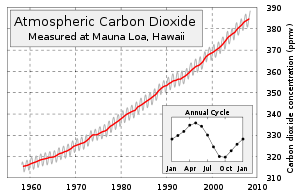
As you can can see, CO2 levels at Mauna Loa, HI increased from about 315 ppm in 1958 to about 390 ppm now. (There is some dispute about the causes of that increase, but human activities, such as burning fossil fuels, release more than enough CO2 to plausibly explain it.)
Although 390 parts per million is still just 0.039% of the atmosphere -- a very small amount -- it represents a 24% increase in atmospheric CO2 levels compared to 1958.
Q: So how have sea levels responded to that increase?
A: They haven't responded at all.
Sea level measurements from coastal tide gauges have shown no acceleration at all in the rate of sea level rise in the last 75 years. In fact, many studies have found a slight (but perhaps statistically insignificant) deceleration in rate of sea level rise, per Houston & Dean:
http://www.jcronline.org/doi/abs/10.2112/JCOASTRES-D-10-00157.1
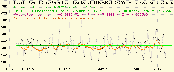
For instance, here in North Carolina, we have one GLOSS-LTT tide station, at Wilmington. The sea level trend for the full 76 year tide gauge record there is +2.0 mm/yr, but over the last 20 years the trend has been -0.3 mm/yr (i.e., sea level has fallen slightly):
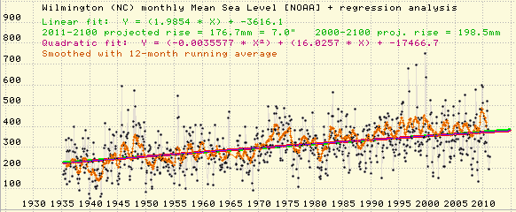
(The negative quadratic coefficient indicates a very slight deceleration in rate of SLR.)
I encourage you to look at the mean sea level graphs for the other 158 GLOSS-LTT tide stations, too. I've made it easy to do that: I put a spreadsheet on my web site, where you can click on the station names (and the "[2]" or "[3]" links) for each tide station to see the graphs at noaa.gov and/or psmsl.org. Here it is:
http://www.burtonsys.com/climate/MSL_global_trendtable1.html
(The only problem with the other 158 tide stations is that NOAA's regression analysis and graphs are about a half-decade old. For Wilmington, I did the graphs and regression analysis using data through early 2011.)
I promise that after you've looked at a few more tide stations you will be convinced: there clearly has been no acceleration in rate of sealevel rise, period, for at least the last 75 years. That means increased atmospheric CO2 levels have not resulted in an increased rate of sea level rise.
Sea level measurements by satellites also show no acceleration at all in the rate of rise, over the 18 years for which we have data. Over the full 18 year span, sea level rose an average of about 3 mm/year, but over the last five years it has risen at less than half that rate, and last year it actually fell. Here's the graph:
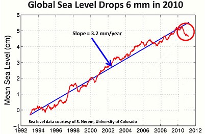
When neither tide gauges nor satellites show any acceleration at all in rate of sea level rise, it means that the rate of sea level rise definitely is not increasing.
Sea levels are rising at some coastal tide stations, and falling at others (which is not surprising, since the earth's crust floats on a vast lump of molten magma, and it's sloshing):
(Note: 1/4 of the GLOSS-LTT stations are at locations where sea levels are falling, rather than rising.)
Even the IPCC's Third Assessment Report (2001) noted the "observational finding of no acceleration in sea level rise during the 20th century."
http://pages.citebite.com/i4h4m7k3aqep
Take a look at Warnemunde, Germany. It has a particularly good quality 150-year continuous tide gauge record, and a typical rate of sealevel rise (1.2 mm/year). Here's graph of its mean sea level, from noaa.gov. Do you see any acceleration?
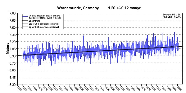
Neither do I.
A few other tide stations seem to show that there was a very slight increase in rate of sea level rise in the first 1/3 of the 20th century and/or the late 19th century, but there definitely has been no acceleration at all in rate of sea level rise in the last 75 years (which, of course, covers nearly all of the anthropogenic increase in atmospheric CO2).
The only way to create a graph that shows acceleration in rate of sea level rise over the last 75 years is by fraud.